VVAVES
A surf forecasting and real-time buoy data visualization app

Please Note: Sometimes this server goes to sleep due to inactivity. It may take up to 30s to spin back up and serve the page. Please be patient.
The Birth of VVAVES
VVAVES is a passion project I started in my free time during COVID. During this period I was surfing a TON - it was one of the few safe social distancing activities I had at the time. Naturally I got pretty obsessive about surf forecasting. At some point it hit me that all surf forecasting services are mostly derived from publicly available data. This freely available data comes mostly from NOAA (National Oceanic and Atmospheric Administration), a government entity. NOAA's network of ocean buoys provides the gold standard for real-time ocean metrics while NOAA's WaveWatch3 model provides industry leading predictive data.
The Problem with Over-reliance on Predictive Models
Surf forecasting services, such as Surfline, add value with their proprietary near-shore models (and cams, definitely their global network of cameras too). These models take predicted open ocean wave data (most likely from NOAA, and attempt to predict exactly how big and powerful the actual breaking waves will be at different surf breaks. This works quite well, but in my opinion, these services rely far too heavily on predictive models, while almost entirely ignoring the wealth of real-time data coming from the buoys!
What Makes VVAVES Different?
VVAVES is an attempt to bring focus back to the real-time buoy data. These aren't predictions, they are actual observations happening NOW. While this data is already freely available to the public, the data isn't exactly intuitive to the average surfer, boater, or fisherman. Complex wave data is typically represented in giant data tables. VVAVES is predominately an exercise in data visualization. How can we take all this complex real-time data and display it to a user in an intuitive way that helps them understand whats going on in the ocean right now, how it is changing over time, and answer the main question: "Should I surf today?".
Logo Design/Animation
I had a lot of fun designing this creative little animation that slides between the full name "VVAVES" and the stylized abbreviation / logo "VVV" (which IMO looks kinda like a wave).
![]()
Rethinking Wave/Swell Data UIs
Across the top of the app are three panes filled with visual information. On the left we have a map with all the nearby buoys displayed. The center pane visualizes the live wave data at the selected buoy. The rightmost pane shows a spectrograph - all the technical details about the swell data being visualized in the center pane. This is the complete spectral data being collected by a buoy at a given time. This lets us visualize much more nuanced data on the swell energy distribution. We can see all the different component swells that are currently in the water, what direction each of them are coming from, and the energy and period associated with each. Think of it as sort of an expert mode.

The Wave Rose
Finally we have my 'wave rose' concept. I've never seen a visualization like this before, but to me it was the most intuitive way to visualize different swells with different properties all converging on a beach somewhere. Since water waves are just sine waves, why not represent them visually as such? There's honestly not too much I have to explain here as the visualization is quite intuitive. Waveforms with a greater amplitude represent bigger swells. The distances between peaks represents the wave period, and the thickness of the line is correlated with power. I developed and animated this visualization entirely with SVGs.
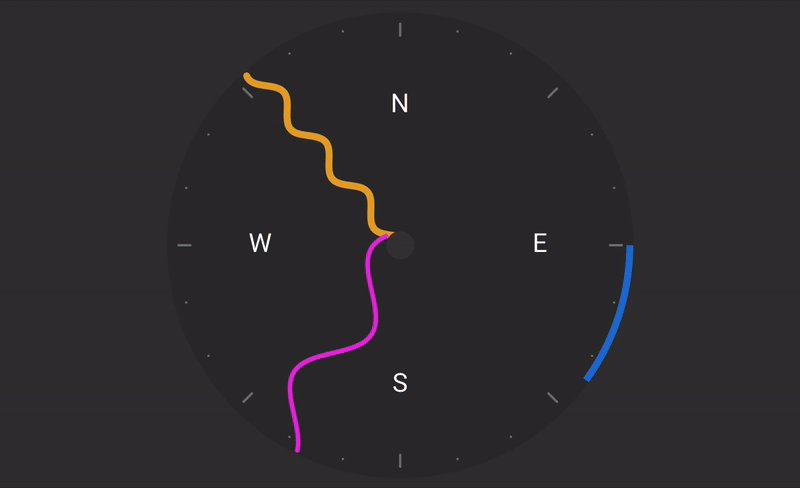
The blue segment along the outside of the compass represents the wind direction. Its width represents direction variability, while each consecutive bar represents 5 knots of wind.
As the user clicks on different times on the time series significant wave height graph (just below the top 3 pane section), the visualizations update the reflect the data at the selected point in time.
I'm pretty proud of this little visualization. It's super intuitive and I think it does a great job of giving a bird's eye view of what's going on in the water without all the tables and numbers.