Wanderlust Careers
Data-driven, automated career assessments
Wanderlust Careers started as a traditional career counseling service. I was brought on as CTO to re-envision the service as a web 2.0 product that would enable the business to aggressively scale its customer-base without scaling its costs. The goal was to dramatically improve the user experience while simultaneously automating as much as possible. End result: happier customers, more revenue.

The Legacy User Experience
The legacy user experience consisted of an in-person intake interview and a battery of written tests customers would be mailed to complete. After about two weeks (after manual scoring of said tests), a written report would be delivered the customer. Results would be reviewed in a 45 minute in-person consultation with a career counselor.
The Vision
23andMe was a huge inspiration for me on this project. 23andMe was able to take traditional genetic counseling (which was prohibitively expensive) and bring it to the masses via automated laboratory workflows and really slick data visualizations. Instead of meeting with a genetic counselor and getting sent back a report, customers could simply spit in a test tube to get to explore a ton of very cool interactive data visualizations about themselves (which is way more fun than reading a report).
It was clear to me that we could accomplish something very similar with career coaching - and excitingly this was something that no one else was doing. Customers could take all the tests online via our platform. Everything would be scored automatically and instant results would be presented to the customer complete with interactive data visualizations via a web app.
In-person meetings could move to Zoom video calls and scheduling could be automated with Calendly. Customers could simply visit our website's landing page to learn all about the products and services offered and if they were interested, they could choose a package, purchase it, and schedule their first meeting all from the web app (with no human intervention required).

Data Input and the User Experience
Simply moving all data input from paper to an app was a huge win for the user experience, but I wanted to make the experience better than your typical online web form. The data input phase for our customers is somewhat long and arduous. Unfortunately that data is super important and there's nothing that can be done other than being super transparent about the time required for each assessment and making the whole experience as easy and stress-free as possible.
For starters we broke data input down into smaller chunks that the user could complete at their leisure and in their preferred order. Every assessment clearly explains what it is, why we use it, and how long the user can expect it to take to complete. A global progress bar is displayed across the top the user dashboard at all times so they know exactly where they are in the process. Each individual assessment also displays the user's progress in real-time. Unlike most web-forms, progress is saved after each question. Users are free to take breaks whenever they want without fearing losing their work.
Challenges
One of the greatest challenges of this project was maintaining the perceived value of the product/experience while automating as much of the product as possible. While a lot of the new improvements drastically improved the user experience, there was no getting around the fact that this was originally a very high-touch service with a ton of hand-holding and in-person interaction and would be transitioning to a much lower-touch, automated experience. Was it possible to keep our high prices AND serve many, many more customers?
Originally I was pushing to throw out the high prices and make up for it with volume. Half the price, but 10x the customers is still a 5x gain in revenue after all. There was a lot of concern that such a move would devalue the brand. We also discussed splitting the product into two separate brands: the legacy high-touch, expensive service, and the new, much cheaper, mostly automated service. The biggest issue here was the extra overhead of marketing two separate brands.
In the end we decided that the best solution was a tiered approach. We would keep it all under one brand, but offer multiple different tiers of service. The cheapest would have minimal user interaction, while the most expensive would retain the high-touch feel that customers seemed to love. Anyone on a lower tier could upgrade at any time to get more of the high-touch services such as going over their results with a Ph. D. level career coach.
Data Visualizations
Here I wanted to go over a few of the data visualizations I designed and why I made some of the choices I did.
Meyers Briggs Personality Type
This is a classic personality analysis test you've probably already heard of. It reduces ALL personalities to just 16 different 'types' indicated by 4 letters (each of which can be only one of two values). The major shortcoming of how this data traditionally gets presented is that they simply reduce you to 4 letters (each a binary result) - they don't bother to go into the degree with which you are an introvert vs an extrovert for example. Since we have the data, I decided to show it!
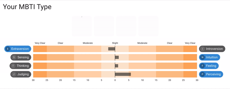
What you can't see in this gif is all the information hidden in hover states. Each of the 4 slots and 8 extremes are explained via popups as the user navigates the data.
Depression Screening
This was all about just showing the customer where they lie on a linear scale. I decided to use a linear gradient to visually indicate the level of depression (cool/blue = sad, warm/orange = happy). There are important cutoff values that had to be shown. Below the visual representation is a text description for each major category.

NEO Personality Inventory
This test is all about breaking your personality down into components and then comparing yourself to the rest of the population for each of them. I think the best way to intuitively understand this data is with a standard distribution curve. It's a great way to visually compare yourself to average and see how much you differ from 'typical' at a glance.
Each of these major categories is further broken down into sub-categories that can be exposed by toggling the twirl-down to reveal nested data within. Hiding the nested data helps keep the page from feeling visually crowded and overwhelming while also intuitively representing the hierarchical nature of the data.
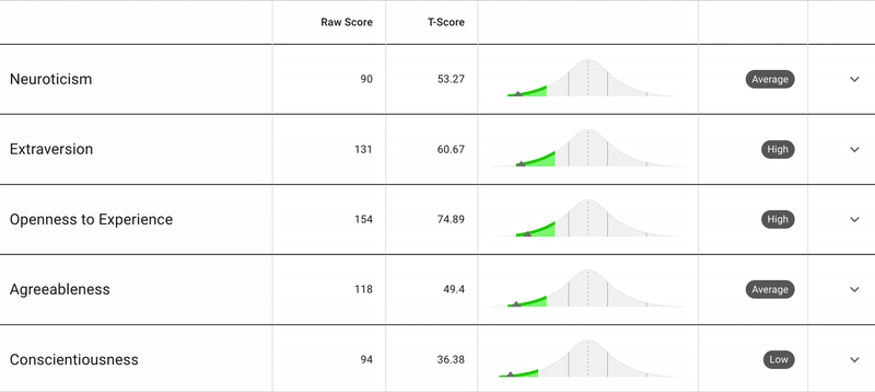
The standard deviation segment you lie within is highlighted green for emphasis (by far the most important takeaway) while a little carrot shows precisely where you lie within that segment. ± 1 SD signals are flagged with an accompanying text analysis.
Strong Interest Inventory
This one helps you understand your interests

Skill Confidence Inventory
And this one is your own perception of your skills

Occupational Scales
And finally a HUGE list of jobs picked just for you. Sortable, filterable, etc. All the good stuff.
